|
The GUGGENHEIM MUSEUM
|
|
|
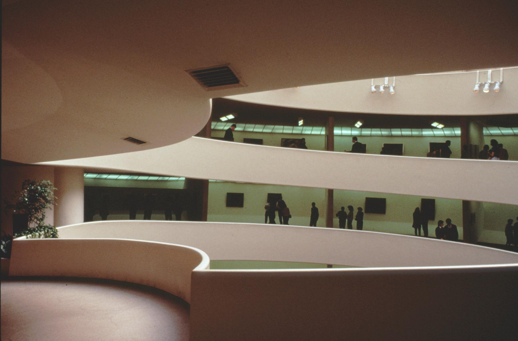
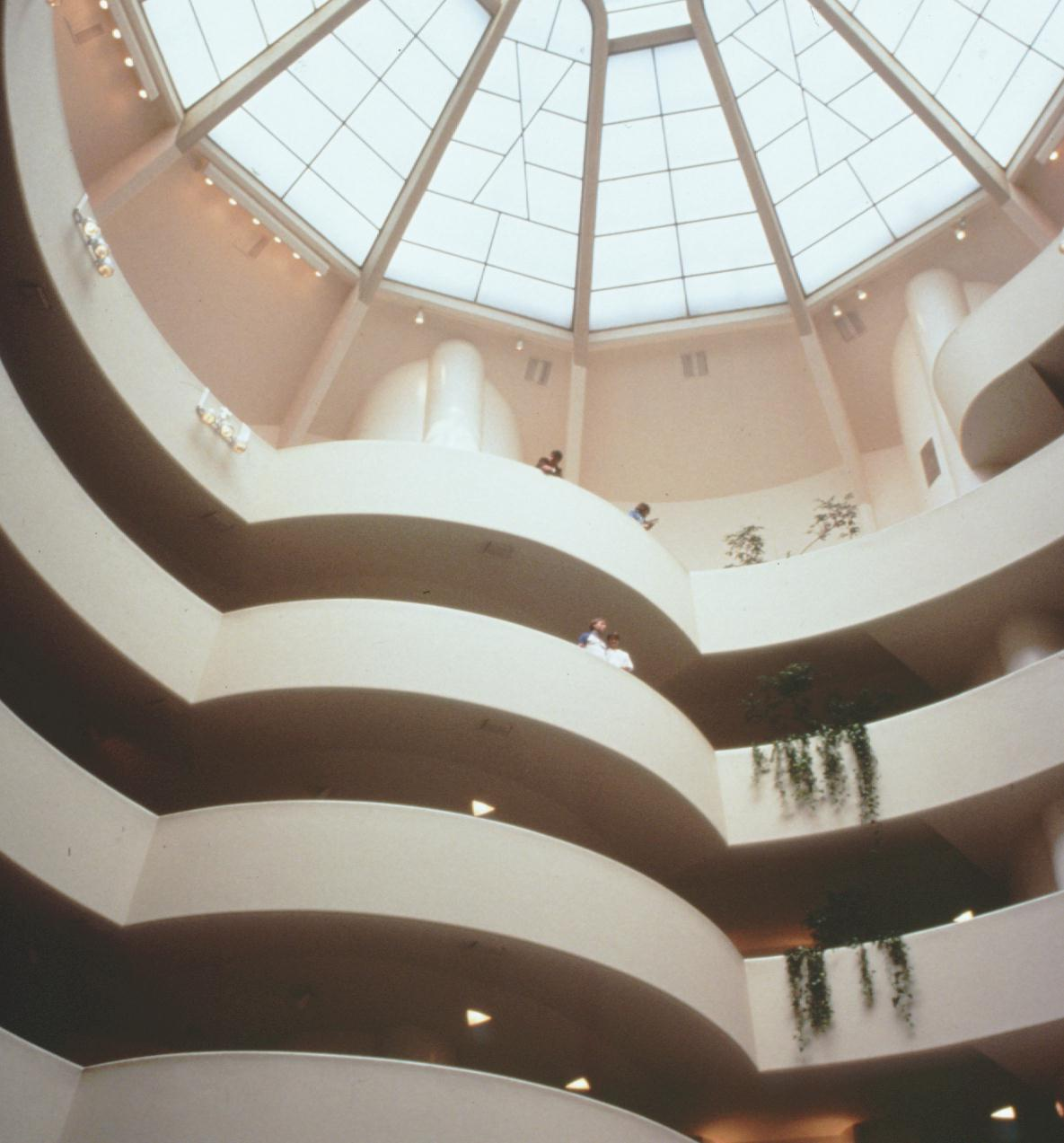
At some point after the building's completion," McCarter says, "the museum staff closed these clerestories, inserting continuous fluorescent lighting behind the translucent panels and mounting fluorescent bands and spotlight to the ceilings, so that daylight no longer enters the individual ramping gallery spaces and the pure smooth surface of the ramp ceilings--into which Wright had recessed triangular down lights--is compromised." And when we add that the drive through was totally eliminated and the sculpture garden was removed in lieu of a money-making book store--and other changes too numerous to list--we realize that changes made by lesser minds hurt Frank Lloyd Wright's masterpiece. Yet it is still a wonderful building! But why was this museum designed in such a way, in the round, having in effect no floors but being instead a continuous floor, a flowing space? I was in New York recently, and I spent three hours at the Metropolitan Museum looking at a small portion of the wonderful paintings there, and by the end of that time I was exhausted. "Museum fatigue," I believe it's called; caused from walking a few paces and standing, walking a few paces and standing, ad infinitum. But Frank Lloyd Wright's Guggenheim Museum eliminates that problem, for if you take the elevator to the top and then slowly walk down that gently sloping ramp, looking at the paintings as you descend, you do not get museum fatigue, and when you complete the tour you are standing at the exit. Guess it's the walking down that takes the strain off the back of the heals. And Mr. Wright was aware of this. Frank Lloyd Wright was aware of most things. For instance, the inside space, always circling, round and round, level after level, could cause a sort of vertigo, a dizziness almost, a lack of orientation and confusion of exactly where one was within the building. It could, |
except for one fact: at each "level", Mr. Wright broke the continuous plane of the curving balcony and changed it, making it curve in the other direction for a short space, creating a counter curving balcony, thereby having the viewer always able to know where he was within the space, what "level" he was looking at, which one he was on--and giving the person the ability to move out into the open space and look down from even a better angle.
Photo by Nelson Brankin |
| < 1 2 3 4 5 > | |
 |
|